In an era defined by petabyte-scale telemetry streams and complex multi-cloud ecosystems, raw tabular data obscures the very insights organizations need to survive. Data visualization is neither a purely decorative graphic design craft nor an automated spreadsheet export; it is a rigorous engineering discipline operating at the convergence of cognitive psychology, statistical mathematics, and high-performance browser rendering pipelines. Transforming raw quantitative metrics into structured visual representations empowers human decision-makers to identify anomalies, evaluate correlations, and extract actionable intelligence in milliseconds.
The Human Perceptual Engine: Preattentive Processing and Visual Encodings
Human vision processes graphical information orders of magnitude faster than alphanumeric text. The human brain decodes visual primitives—such as position, length, shape, and hue—within 200 milliseconds through a neurological mechanism known as preattentive processing. Long before conscious cognitive effort is applied, the visual cortex categorizes outliers and recognizes patterns.
However, not all visual encodings communicate information with equal accuracy. Seminal research by statisticians William S. Cleveland and Robert McGill ranked graphical channels by perceptual decoding precision:
- Position along a common scale: The most accurate visual encoding channel (utilized in standard scatter plots and aligned bar charts).
- Position along non-aligned scales: Highly accurate for comparative trend evaluation.
- Length: Highly effective for discrete categorical comparisons.
- Angle and Slope: Significantly less accurate for precise numerical estimation (which explains why pie charts and radar charts introduce cognitive distortion).
- Area and Volume: Consistently underestimated by human observers due to nonlinear geometric scaling perception.
- Color Saturation and Hue: Ideal for qualitative grouping, status alerts, or heatmaps, but inherently imprecise for quantitative scalar measurements.
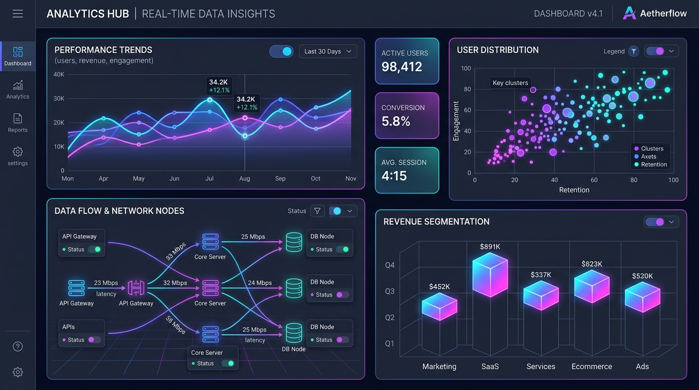
Browser Rendering Architecture: SVG vs. Canvas vs. WebGL
When engineering high-throughput web visualization systems (such as financial trading terminals or distributed telemetry dashboards), choosing the underlying browser graphics primitive dictates application latency, memory consumption, and interactive fidelity:
| Rendering Technology | Optimal Data Threshold | Interactivity & Event Model | Accessibility Tree Integration | Memory & CPU Footprint |
|---|---|---|---|---|
| Scalable Vector Graphics (SVG) | 1 – 3,000 DOM Elements | Native DOM events (click, hover, focus) | Full (Native ARIA roles and titles) | High (Heavy memory per DOM node) |
| HTML5 2D Canvas | 3,000 – 100,000 Data Points | Manual hit-testing (quad-trees / color picking) | Indirect (Requires fallback DOM tree) | Extremely Low (Single flat raster bitmap) |
| Hardware-Accelerated WebGL | 100,000 – 5,000,000+ Points | Raycasting & GPU picking shaders | Indirect (Virtual screen reader layer) | GPU-bound (VRAM texture buffers) |
For standard editorial charts and executive dashboards with small-to-moderate point density, SVG paired with D3.js remains the gold standard because each vector node exists as a distinct DOM element, enabling fluid CSS animations and full ARIA accessibility integration. However, when rendering real-time distributed telemetry with tens of thousands of streaming nodes, SVG triggers massive garbage collection pauses and DOM layout thrashing. In high-density environments, engineers must pivot to HTML5 Canvas or WebGL (via libraries like deck.gl or Three.js) to leverage GPU parallelization.
Edward Tufte's Data-to-Ink Invariant
Renowned information designer Edward Tufte established the Data-Ink Ratio: the proportion of a graphic's ink (or pixels) devoted to the non-redundant display of data information. Exceptional data visualization ruthlessly eliminates 'chartjunk'—gratuitous 3D bevels, heavy dark gridlines, redundant legends, and distracting background gradients—ensuring every rendered pixel conveys authentic meaning.
Interactive Hit-Testing and Voronoi Tessellation in Canvas
One of the primary engineering hurdles when transitioning from SVG to 2D Canvas is the loss of native DOM event listeners. In an SVG chart, attaching a tooltip to a specific data point is as simple as adding an onMouseEnter handler to an SVG <circle> element. In Canvas, the browser sees only an opaque grid of pixels.
To deliver instantaneous 60 FPS tooltips and point selection across 50,000 data points on a Canvas surface, engineers employ spatial indexing data structures:
- Delaunay Triangulation and Voronoi Diagrams: By calculating a Voronoi diagram over the dataset, the 2D coordinate plane is partitioned into polygonal cells such that every point within a given cell is closer to that cell's seed data point than to any other. Capturing mouse coordinates and performing an $O(1)$ or $O(\log N)$ spatial lookup against the Voronoi polygon allows the UI to highlight the nearest data point instantly—even when points are small or clustered tightly together.
- Quad-Trees and Spatial Hashing: When data points update continuously in real-time, rebuilding Voronoi meshes every frame introduces computational overhead. A 2D Quad-Tree partitions screen space recursively into quadrants, enabling rapid bounding-box collision detection that ignores distant data clusters.
Real-Time Streaming Telemetry and 60 FPS Animation Loops
High-frequency operational dashboards (such as cloud cluster monitoring or algorithmic trading views) receive hundreds of WebSocket metric updates per second. Directly triggering React component state updates on every incoming WebSocket packet causes devastating render cascades and dropped animation frames.
Resilient visualization engines decouple network ingestion from rendering cadence:
- Circular Ring Buffers: Incoming WebSocket payloads are pushed into fixed-capacity ring buffers in Web Worker memory threads, avoiding garbage collector reallocation churn.
- Animation Synchronization via requestAnimationFrame: Rather than re-rendering on network arrival, the visualization loop hooks into the browser's native
requestAnimationFramecycle (16.6ms per frame at 60Hz). During each frame, the canvas renderer pulls the latest interpolated snapshot from the ring buffer, draws the updated line vertices, and flushes to the screen in a single compositing pass.
Color Systems, Cognitive Ergonomics, and Accessibility
Color is one of the most misused dimensions in visual analytics. Defaulting to arbitrary palette selections or legacy rainbow color maps (such as 'Jet') introduces dangerous perceptual artifacts. Because human retinal cones perceive changes in yellow and green wavelengths as significantly brighter than blue and red, rainbow spectrums create false artificial boundaries in smoothly varying scalar data.
Modern visualization engineering enforces mathematically uniform color spaces:
- Perceptually Uniform Palettes: Standardizing on scales such as Viridis, Magma, or Cividis ensures that equal numerical steps in data correspond to equal perceived differences in color lightness.
- Color Vision Deficiency (CVD) Resilience: Approximately 8% of men and 0.5% of women experience red-green color vision deficiency (deuteranopia or protanopia). Critical operational states (such as success vs. error) must never rely on red and green hues alone; they must pair color with secondary visual channels (icons, text labels, line patterns).
- WCAG 2.1 AA Contrast Ratios: Data marks, axis tick lines, and numerical callout labels must maintain a minimum contrast ratio of 3.0:1 against adjacent chart backgrounds to ensure legibility across varying ambient lighting conditions.
Engineering Declarative Graphics: From Imperative Scripts to Grammars of Graphics
Building maintainable enterprise analytics suites requires moving beyond brittle imperative JavaScript scripts where every rectangle and circle is calculated by hand. Modern systems adopt the Grammar of Graphics philosophy (formalized by Leland Wilkinson and popularized by Vega, Vega-Lite, and ggplot2).
Under a grammar of graphics architecture, visualizations are declared as structural JSON specifications describing data bindings, coordinate projections, and visual marks. By decoupling the visualization specification from the underlying rendering engine, teams can dynamically switch between SVG and Canvas backends, automate server-side static chart rendering for automated PDF exports, and establish reusable dashboard component libraries that scale seamlessly across enterprise applications.